Problem:
While doing improvement work for the swimming pool registration and compliance process, it was discovered that customers faced significant challenges when trying to submit their certificates of compliance or register their swimming pools and spas due to a poor website experience. This lead to 120 refunds needing to be issued in 3 years, and increased manual workload for the building compliance team.
Many encountered unexpected errors that prevented them from completing their registrations, leading some individuals to submit their applications multiple times.
The duplication not only created confusion but also resulted in prolonged wait times for refunds, causing frustration among residents.
The lack of clarity regarding compliance obligations left many customers unaware of their responsibilities
The overall experience has highlighted the pressing need for improved digital systems to ensure residents can navigate compliance processes effectively.
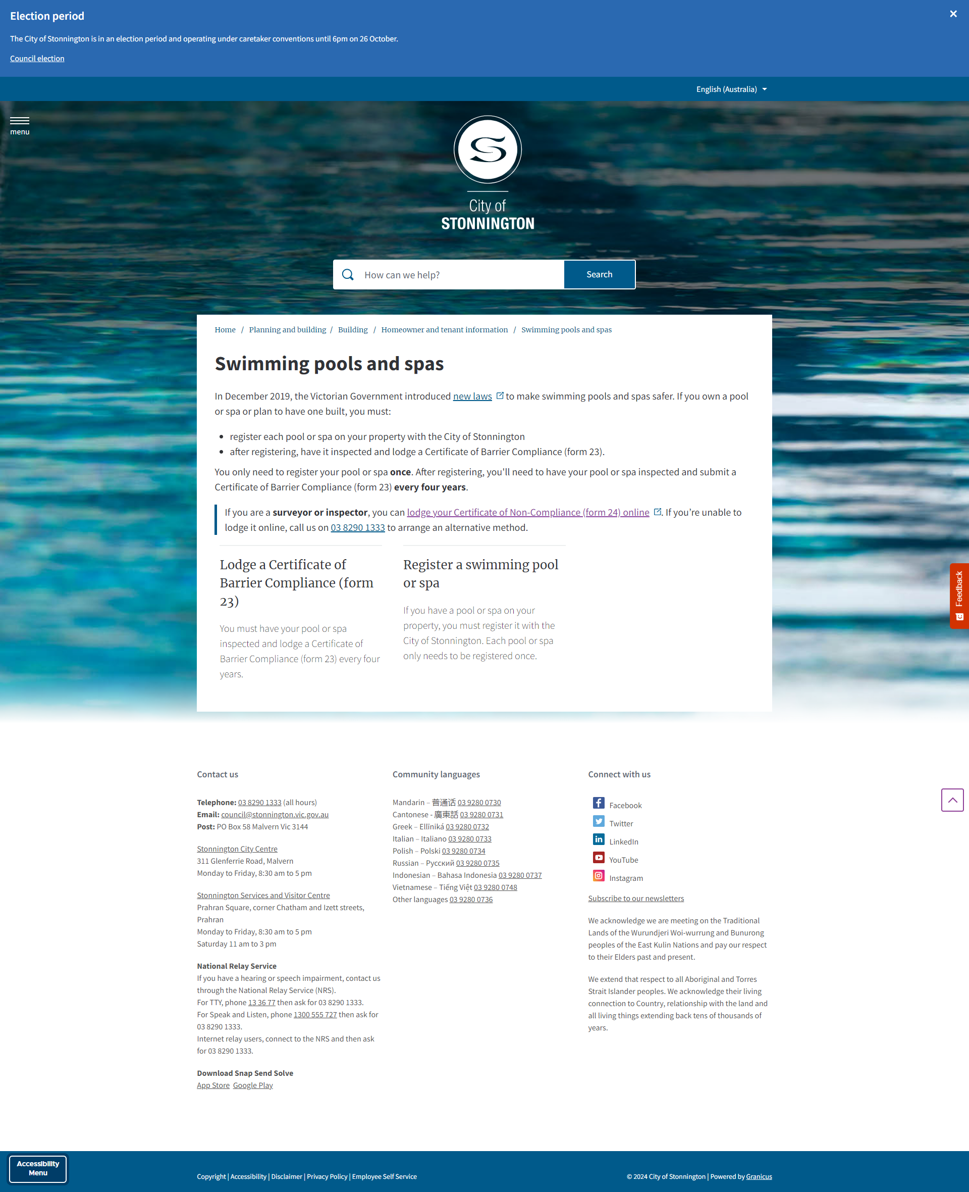
Original webpage layout
Submission portal layout
Original Design
Looking at the problem from a design lens, I found that there were a few issues with existing design:
There was only one webpage dedicated to swimming pools and spas, and it was focused on registering - with lack of clarity and steps on how customers can get their barrier checked and submit their compliance certificate
Most customers have already registered since the webpage launched, many were now needing to comply
The portal where customers can submit their compliance certificate lacked the ability to allow direct linking. Which means customers land on a page and then select from a list of forms to submit, leading to further confusion

Working closely with the Continuous Improvement lead, we were also able to obtain customer insights, and explored the journey end to end in order to identify and solve the pain points. We found customer feedback such as:
“(I was) not aware the pool was registered by the previous owner, thought I was doing the right thing, system allowed me to continue registering”
We were able to identify that customers attempting to submit their compliance certificate often face poor UX in the portal, which leaves them unsure of which link to click and may result in mistakenly selecting the registration option, despite already having registered their swimming pool or spa.
A journey map was also created to further understand where pain points and possible questions could lie, so we could ensure the content met customer’s needs.


Design strategy:
As a result I came up with the following design solutions:
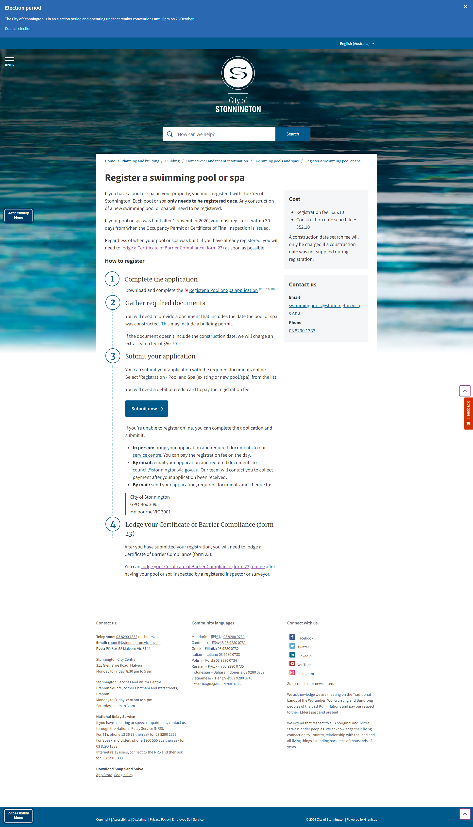
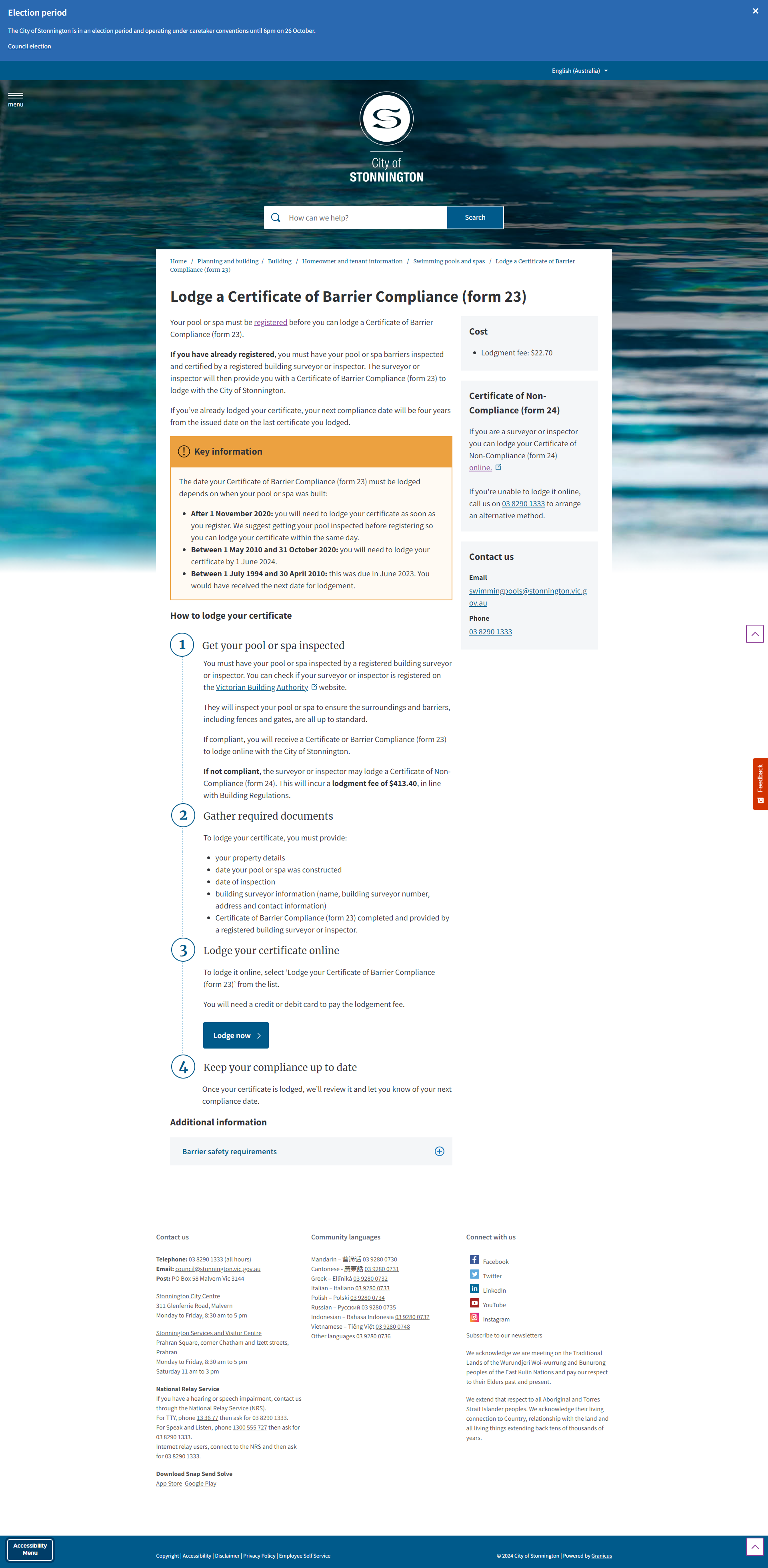
Splitting up the page into two separate pathways, one for registration and one for compliance
Clear and transparent stepped instructions that encourages customers to begin the compliance process as soon as they have registered
Rewriting of content to make it clear when and how a customer should begin their compliance process, and how much the fees are

Research & Preparation:
As part of the research, I utilised UX data tool Hotjar to gain insights into customer interactions on our webpage. By analysing heat maps, I was able to visualise areas where users engaged most frequently, identifying hotspots of interest that highlighted which sections captured attention. Additionally, click maps provided a detailed view of where users were clicking, revealing patterns in navigation and helping to pinpoint potential obstacles in the user journey. Utilising both maps I was able to identify that most customers went on to the webpage to primarily submit their compliance certificates, but then would encounter user error that results them in registering twice.
Design & Technical Constraints:
The portal containing the links to the form could not be updated. Due to the legal requirement that customers must agree to a privacy statement before proceeding, we cannot directly link customers to the right form.
Brainstorming with the CX team, we were able to strategise that:
When the UI of a portal or product can’t be changed, then sufficient and precise instructions should be added in the webpage
Update naming conventions as much as possible to use the same language in both form and portal to improve recognition and familiarity
In addition, when rewriting the content, we had to work close with the business units to precisely communicate:
The legalities of compliance requirements and steps while maintaining government accessibility writing guidelinse
When to register and what happens when they don’t comply
The deadline of compliances
As a result, we ended up:
Changing the name of the form on the portal front page to be more clear what is registration and what is for compliance
Ensuring the exact naming is provided in the instruction
Using accessible language to step out compliance deadlines, and content design to encourage compliance as soon as they’ve registered
Impact
Working closely with the business units, we were able to refine the webpage content to clearly display precise steps, instructions and clear information.
After 6 months of launch, the improved design changes lead to:
97% reduction in refunds being processed
122 hours of staff time saved in processing refunds
30% increase in online portal applications
Want to learn more about this piece of work in more detail? Reach out for a chat.