Problem:
One of the core points of conversion for Scriptly was its membership programs called Scriptly Perks, which were not well highlighted on its product page. The marketing manager in charge of this account felt that this was poorly highlighted from a design perspective, which made it hard to promote the perks in it’s digital marketing campaigns. The marketers briefed to me that the product pages needed a design update to highlight their membership offerings in order to allow customers to understand and sign up as members so that they can run more effective ads.
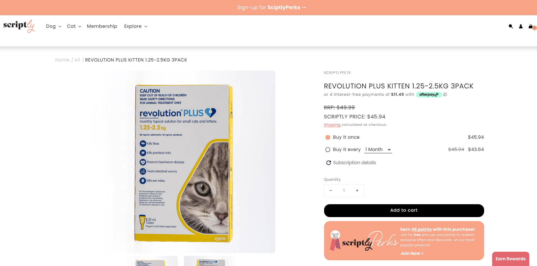
Original Design
Looking at the problem from a design lens, I found that there were 3 main problems with the product page:
The top eyebrow banner was not visible to highlight the membership feature
Earn rewards at the bottom were poorly aligned and did not stand out
Lack of info anywhere on the product page to highlight what the membership feature actually does


Design strategy:
As a result I came up with the following design solutions:
Updated the colour for the eyebrow banner to a greater contrast to the rest of the page so that it would grab more attention
Created a box below the ‘Add to cart’ button to highlight Scriptly Perks with dynamic points. This is to show the user how many points they could earn for any specific purchase an incentivise them to buy or join the program.
Description to assist the user in understanding the program
Earn rewards pop up in a brighter colour and more prominent
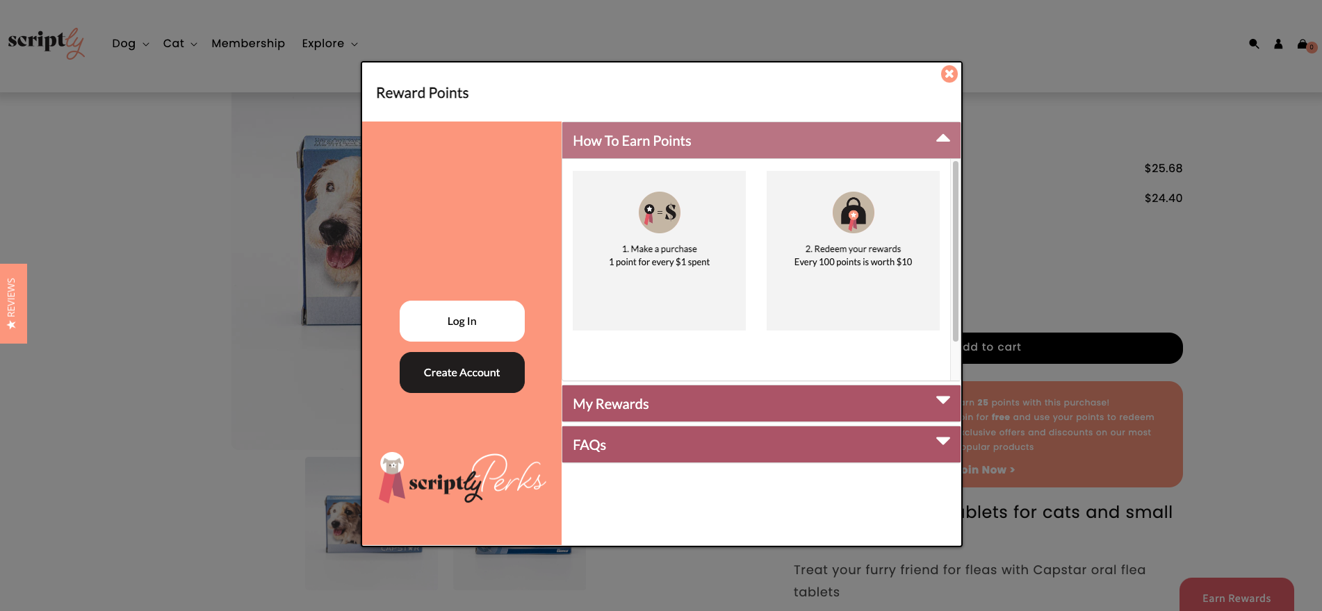
Re-designing the pop up including:
More information about Scriptly Perks was added to inform user about the benefits of the program
Graphics added with steps on how to earn rewards so that it’s easier for users to understand
FAQ included to add more information
Login and Create Account with call to action text added to improve conversion
Research & Preparation:
As this was a fairly straightforward project of revamping the design of the products page to improve sign up for Scriptly Perks, some qualitative research was done by looking at competitor’s existing designs and benchmarking design styles and standards in order to come up with the strategy of the re-design. Some of the competitors I looked at included Catch and Myer who had extensive membership programs, to look at how they highlighted it on their website as core value propositions. Some of the key things I found were:
A well highlighted box promoting the perks and points possible earned below the add to cart CTA’s
CTA to incite users to join perks
Explanation of what the perks were to highlight the benefits of it
Design & Technical Constraints:
As Scriptly was on Shopify, after handing off the design I worked with the developers extensively to work through the constraints of the Shopify platform. Some problems I encountered included:
The difficulty of implementing dynamic numbers for the points earned
Not being able to have the boxes in the pop up always expend
Not being able to add 2 boxes in the pop to show the steps of the Scriptly Perks processes
As a result, I then had to continue to work together with the developer to explain my design rationale and processes. After working with them collaboratively, we able to come up with the live version that adhered to technical constraints while maintaining as much of the original design as possible. Which meant that I had to create a design that was:
Not being able to fully expand all the boxes of the pop up, therefore the steps were prioritised at the top to show the process of Scriptly perks
Dynamic pricing was sorted after explanation of what how it should work and looking through the coding together with the developer

Impact
The marketing manager was pleased with the end result of the design and satisfied with the update, as it allowed her to run Scriptly ads more effectively to promote one of their core value propositions. As a result allowing Scriptly products to perform better.