Improving conversion on the Pearlii’s booking platform
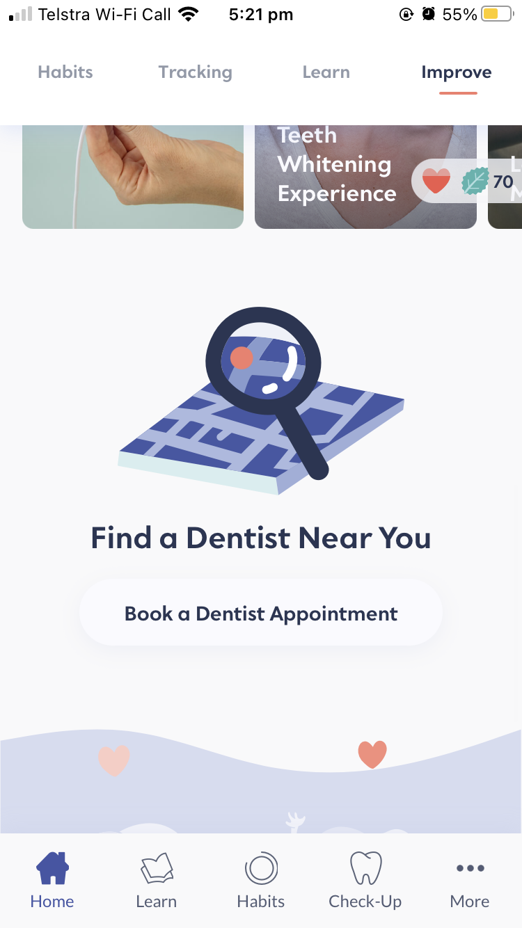
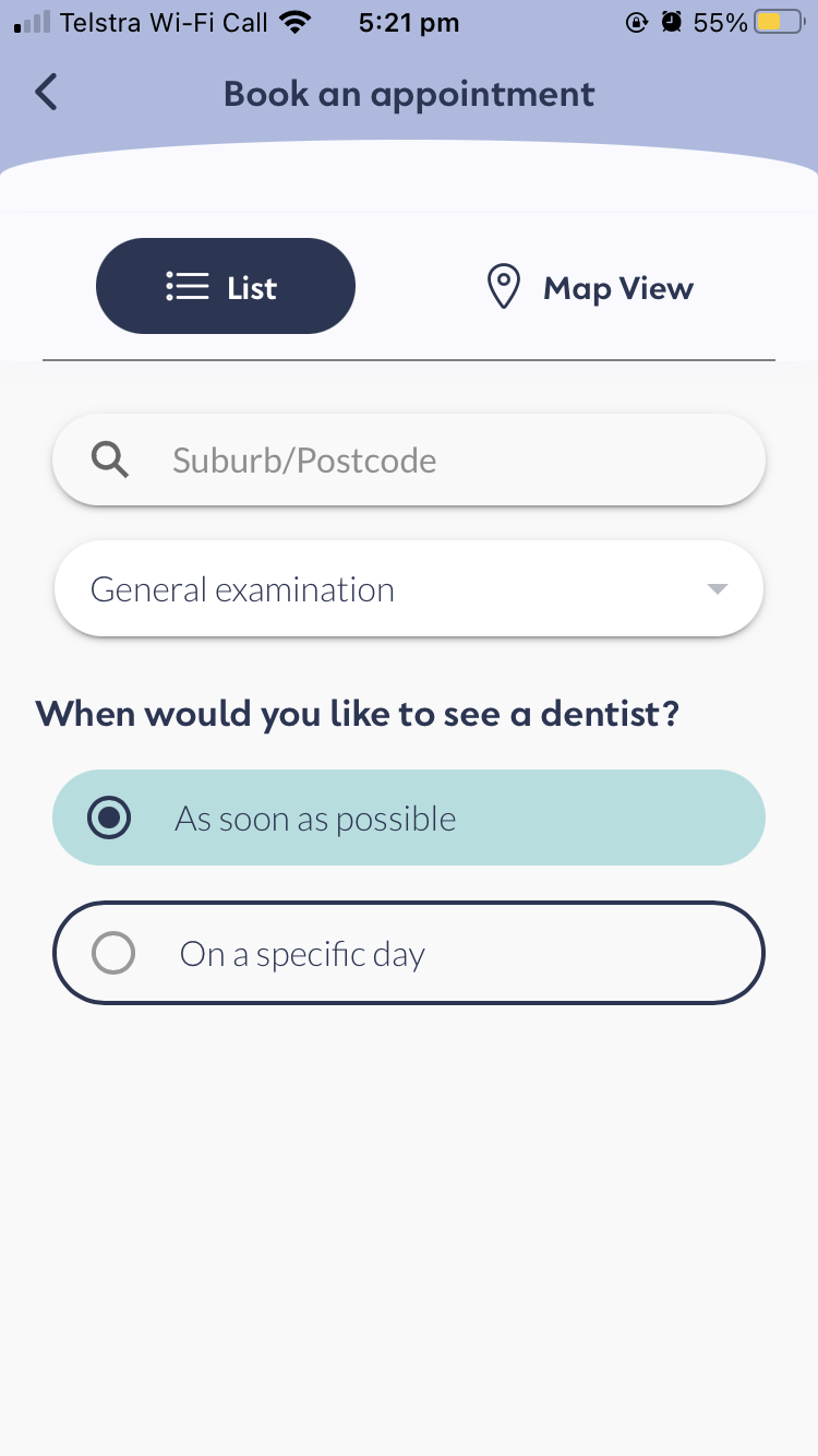
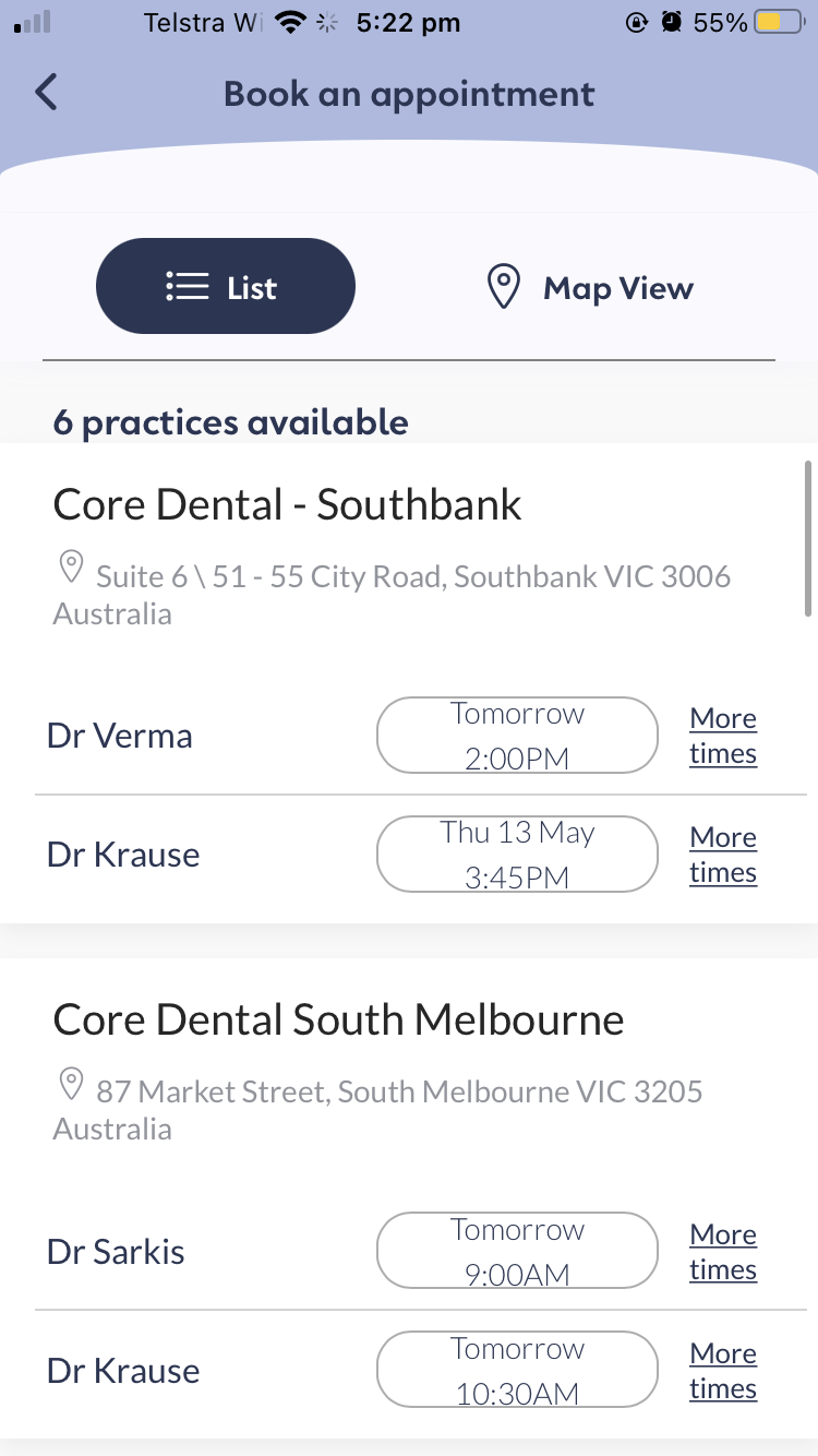
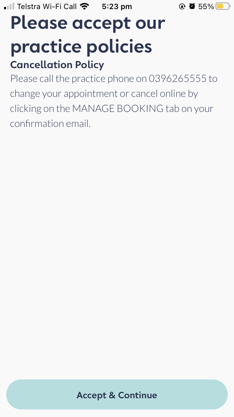
Original Booking Flow
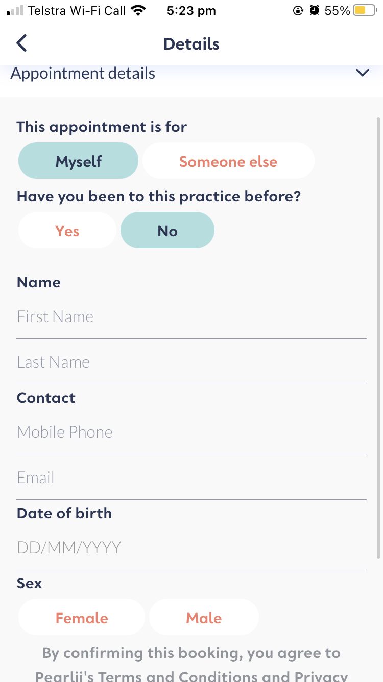
Problem Definition
Rapid usability study April 20th-21st to determine key pain points with current booking flow and insights into broader booking behaviours.
Hypothesis for research:
People who visit the Dentist more regularly find calling easier
People need more information about the Dentist before they are comfortable booking. They may google or look for
reviews.
People won't engage with the map view straight away and this could be because they don't see it or they don't want to
use it (we'll find out which)
People prefer to pick the date and time rather than as soon as possible
People don't know what they need an appointment for and therefore the drop-down with multiple options is confusing
The flow will be determined by what their answers are to their need to visit a dentist, last visit and last experience.
People may have a difference in trust when booking through a third party (will the booking go through, will there be a
delay)
Goals for research:
To get a clearer idea of general booking behaviours for oral health i.e what motivates booking, how they have booked in the past
To find out what information someone needs to book with a new Dentist
To find out currently how easy it is to book, cognitive load and number of steps
To identify pain points that are able to be eliminated by redesign
To identify pain points that are unavoidably part of the data partnership in order to brainstorm damage control solutions
Predicted usability paint points:
The call to action on the homepage may not be obvious to first-time users
The current time options are confusing and the calendar isn't prominent enough
The 'When: specific date' flow Button > Calendar > Date > Edit creates confusion
The fact that there are no error messages to indicate that each box needs to be filled
Affinity Mapping
Conducted affinity mapping by splitting quotes and facts into the following themes based on key tasks concluded in the user research:
Choosing an appointment
Trust with online booking
Increase visibility
Error of online bookings
The following conclusions were created through affinity mapping:
When it comes to choosing an appointment, time and location were the biggest factors, however, this varied between the users
If there is not enough information to differentiate between the dentists, then users will go on to Google to find out more background information before trusting certain dentist
Most users mistook that the booking system would be in a more prominent area of the app
Usability Research Results
User interviews were conducted via zoom, using a guided interview approach, users were asked to attempt to book a dentist appointment as they normally would using the Pearlii app. Results were qualitatively recorded and key points were summarised.
Summary
User behaviour of note:
People don't like to be new patients. Creates a barrier to seeing a new dentist. Aware that being a new patient includes extra paperwork and cost of new x-rays etc and they want to avoid that.
Priority of Trust vs Location depends on the risk-taking nature of the user.
Prioritise recommendations from people they know or health practitioners and then reviews. Recommendations from Pearlii are likely to be viewed as advice from health practitioners rather than a person they know.
Some found the booking system a little confusing to navigate at the end, especially when to confirm their details and how the booking system all tired in
Key tasks for design:
Dentist Display Hierarchy - Users are looking for more differentiating factors between each dentist, such as specialty, bio, backgrounds, education, reviews, photos.
Creating trust - There's a sense of distrust for users when it comes to online booking. Their experiences with other platforms often resulted in the booking not matching adequately with the EMR of the dental practices. Users need confirmation, particularly from Pearlii that the appointment has been booked.
Reliability for booking through the app - Would like ways that Pearlii would assist them in attending their appointments, such as displaying information for the appointment within the app and perhaps setting reminders about the appointment and tips prior to the appointment.
Improve ease of use of booking appointments - users expected it to be more prominent or in one of the selections within their goals section, users found it difficult to find unless they really explored the app. Multiple welcome pages create confusion where the homepage starts.
Ideation
Based on affinity mappings, the following ideas were generated through the ideation session
Google Pop up
Google/search icon for users to click on, pops up with in- app browser that allows users to search up information about the dentist without having to leave the app
Post-booking confirmation pop-up
A confirmation pop-up with all the appointment details, as well as instructions on how to troubleshoot if they do not receive an email. Opportunity to add CTA to add the appointment as a reminder
Pre-booking expectations
New page to booking flow with information about what to expect with the booking system, as well as instructions on how to troubleshoot. Helps to provide expectations of how they could use Pearlii to manage their appointments
Pre-appointment checklist
A new page in flow with a checklist to help them prepare for their appointment. The checklist includes using features within the app to assist them in their appointment to assist in increasing in-app engagement and to communicate the value of using the Pearlii app to book
Mid-fi Wireframes
How to book pop up options
Appointment confirmation options
Pop up reminder options


