PatientPop’s Online Booking System
Hypothesis: The PatientPop Booking platform currently has issues with catering to the idiosyncratic usability need of each healthcare practice.
This project was done outside of my work at PatientPop as a way to practice my UI/UX Design skills. Utilising client feedback regarding booking system over my time at PatientPop in the customer success team, I collated the feedback as a way to review and reiterate the existing booking system to improve the experience for users.
Summary of client feedback insights:
Some practices have multiple locations, but not all providers are at all locations, the existing system makes users pick the provider first then pick the location, which could result in them picking a provider not at their nearest location
The mobile version took too long to scroll and this did not work well on a lot of patient’s older devices that have poor loading issues
There’s a lack of flexibility to add notes regarding the appointments throughout the system, particularly after an appointment has been booked
Lack of flexibility for practices to add notes regarding the specific nature of a booking - i.e. “please call to confirm”
Some practices wish there was a way to add a button that went straight to a specific provider rather than show other providers
Key Design goals:
Provide more flexibility within the booking system to suit the individual need of each practices without completely changing the design and function of the existing system. Reduce the amount of providers switching off the PatientPop booking system and using a third party booking system by at least 40% in 2021
Improve mobile usability to help practices with customer retention for those using older devices, with an aim of at least 20% increase in customer booking through the booking system for provider
Help make the system more adaptable for unpredictable situations that a practice might have i.e. rapid change in protocols due to the pandemic, a sudden unavailability of one provider. Decrease in 40% customer frustration/low customer satisfaction score
Improve the experience for users when booking a provider, create a more understandable user flow that doesn’t lead to dead ends or confusing errors for the patient who then will have to contact the practice to clarify information
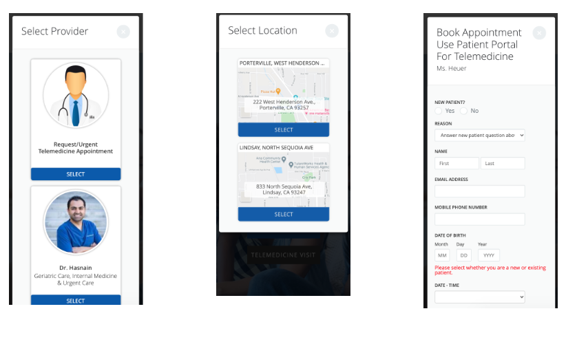
Original Booking Flow (Web)


Original Booking Flow (Mobile)
Re-Design


Ideation/Sketching
Assumptions:
A simplified form will help users fill it out better and increase retention and online booking
Changing the flow will improve user experience
Increasing the number of steps on mobile, but simplifying each step will make loading easier and the mobile version simpler to use
Will need to test out:
Does changing the order of the questions increase customer improving the onboarding experience of new patients?
Does showing the location of where each provider is located reduce confusion on the patient’s end?
Will adding more areas for notes be enough flexibility for providers to cater to their practice needs?
Is there too many steps on the mobile version in the re-designed flow?


Lo-Fi Wireframes
Initial Low-Fi wireframes to create layout
Mobile Version

Redesign Mobile - First Draft of booking flow & high fidelity design
Main feedback:
Didn’t make sense to make users fill out form before they could determine if there was a good appointment time for them
Design was “boring”/”outdated”
Time selection was uneven/spacing was uneven
Final Hi-Fi Mobile Flow


New web booking flow

Re-design: Web
Re-design of the user flow
Re-design of various UI elements of each page

First page of the flow - aims to increase retention of user. The page has been re-designed so that the user can see the provider name, specialty and which location they're available at on the very first page. This reduces the time it takes the user to select the right provider as they don't have to guess which provider is available at which location. The page has also been simplified so that the information stands out more and reduces the clutter of large images.

New page added to flow: this page has been added as an opportunity for the provider to have a page to link to through custom CTA. Also provides an opportunity for the user to select the location after selecting the appropriate provider.

Alignment, centering and order of questions have been changed to improve understanding of hierarchy of information. Doctor's information on right hand corner to ensure users can double check they've got the right provider

Time selection moved to it's own page so that users aren't overwhelmed with the layout of the page, aim to increase user retention

Re-design of the confirmation page provides feedback to the user by confirming booking details. Also provide another opportunity for the provider to add any appointment notes
Patient Form
Design was also changed to the initial patient form based on the following design goals
More clearness on what is the most important information/what needs to be filled out first
More balance and symmetry to aid in visual cohesive

Conclusion:
The overall design aims to improve customer retention (and hence improve practice success) and provide more flexibility for the practice when it comes to using the booking tool for their needs. Overall the new design helps with:
Improving mobile usability - decreases loading speed on mobile
More areas for the practice to customise booking system to match their needs - increases flexibility for the provider to amend the booking system in ways that helps them with their existing booking/appointment confirmation system. Allows them to add more notices, link to specific providers etc. and as a result. help retain providers onto the PatientPop booking system and help Patientpop to retain customers overall on the product
Improving the user flow - the flow has been re-designed to be empathetic to the need of the patients and the providers. Patients will no longer accidentally book the wrong provider at the wrong location, which reduces confusion for both the practice and providers. In the feedback, often patients would click on a provider that did not have the location they needed, leading to confusion. This new flow and hierachy reduces that.
Overall, these changes aim to help improve the PatientPop product and allow our practices to maximise their use of the PatientPop platform to improve their practice growth success and reduce provider complaints regarding the booking system to the customer success team.