Improving PatientPop’s Booking System
Original Booking Flow (Web)


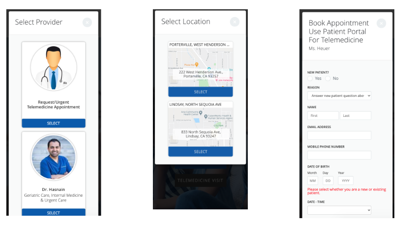
Original Booking Flow (Mobile)
Problem Definition
Qualitative feedback from clients was collated by the Web Designer of the Customer Success team from April 2020 to March 2021 in order to determine the paint points clients were having with the booking system on their PatientPop-designed website.
Hypothesis for research:
The one-size-fit-all booking system was not catering correctly to all the various healthcare practices
The restrictions of the platform from a design perspective makes it hard for clients to integrate with their own booking processes
The design limitations is making it difficult for clients to customise based on specific health protocol needs especially during COVID-19
The design on mobile was not optimised and makes it hard for the patients to access
Goals for feedback collation:
To develop a more mobile-friendly and customisable platform so that clients have less pain points and are more willing to stay with PatientPop
To reduce the workload for the customer success team who are getting an increased amount of customer queries to customise the booking platform
To still have a one-size-fit-all platform that understands the needs of the clients
Usability Research Results
Client feedback summary:
Some practices have multiple locations, but not all providers are at all locations, the existing system makes users pick the provider first then pick the location, which could result in them picking a provider not at their nearest location
The mobile version took too long to scroll and this did not work well on a lot of patient’s older devices that have poor loading issues
There’s a lack of flexibility to add notes regarding the appointments throughout the system, particularly after an appointment has been booked
Lack of flexibility for practices to add notes regarding the specific nature of a booking - i.e. “please call to confirm”
Some practices wish there was a way to add a button that went straight to a specific provider rather than show other providers, particularly for promotions spotlighting that specific provider or to directly link to that provider from their bio page
Key Design goals:
Editability - Provide more flexibility within the booking system to suit the individual need of each practices without completely changing the design and function of the existing system. The goal is to improve the work flow for Customer Success team as well who also experiences pain points of the lack of flexibility with the CMS design system when it comes to customising the booking pop up.
Usability - Improve mobile usability to help practices with customer retention for those using older devices
Customisability and adaptability - Help make the system more adaptable for unpredictable situations that a practice might have i.e. rapid change in protocols due to the pandemic, sudden unavailability of one provider
Improve feedback/trust - Improve the experience for users when booking a provider, create a more understandable user flow that doesn’t lead to dead ends or confusing errors for the patient who then will have to contact the practice to clarify information
Ideation
Simplified Forms
A simplified form will help users fill it out better and increase retention and online booking
Updated Flow
Update the flow to show the location of the providers that they serve from the beginning. This will allow patients to select providers based on their location as well as their name. A new flow will allow patients to then select the provider - this will allow practices to link specifically to a provider to book (the CMS platform allows linking a specific page of the booking popup).
Booking Confirmation
Booking confirmation can provide feedback for clients, provide opportunities for practices to add customisable messages or reminders, and at the same time reduce patient confusion regarding appointment information. This will help improve adaptability and customisability of the booking system
Customisable/Editable text blocks
Adding editable text blocks based on the PatientPop Website Design CMS's design limitations can improve clients' flexibility to add the extra information they want. This will improve work flow for customer success team members as they can quickly add text to the booking sytem
First draft of hi-fi wireframes


Revised/Final Hi-fi Wireframes


Main Design Points:
Added editable text box in booking confirmation, booking form and time selection
Provides multiple touch points for practice to provide more information to support their processes. Such as to provide safety requirements, booking reminders and appointment booking confirmation requirements
Provider-specific page that can be used to link directly to a specific provider for provider spotlight purposes.
Reduced sizing of images and modules so that it could be optimised on mobile devices (see below)
Mobile Optimisation
Mobile optimised version of the web designed. This design was actually designed mobile first then web to ensure that mobile responsiveness was considered from the start


Conclusion:
The overall design was designed from an internal point of view, focusing on adding features that it eases the challenges the customer success team faces when it comes to the booking system and customisation. Such as:
Improving mobile usability - decreases loading speed and improves understanding of information (for the user)
More areas for the practice to customise notices - increases flexibility for the provider to amend the booking system in ways that helps them with their existing booking/appointment confirmation system. Help retain providers onto the PatientPop booking system and help Patientpop to retain customers overall on the product
Improving the user flow - the flow has been re-designed to be empathetic to the need of the patients and the providers. Patients will no longer accidentally book the wrong provider at the wrong location, which reduces confusion for both the practice and providers
Overall, these changes aim to help improve the PatientPop product and allow our practices to maximise their use of the PatientPop platform to improve their practice growth success and reduce provider complaints regarding the booking system to the customer success team, and hence improve retention.
As this is based from internal perspective from client feedback, the user (the patient)’s perspective must be looked at during testing. Things that needed to be tested include:
Does changing the order of the questions increase customer improving the onboarding experience of new patients?
Does showing the location of where each provider is located reduce confusion on the patient’s end?
Will adding more areas for notes be enough flexibility for providers to cater to their practice needs? Are the notes clear for patients?
Is there too many steps on the mobile version in the re-designed flow for patients?