Valles Accounting
Valles Accountants is an accounting business based in Melbourne who wishes to promote their crypto-tax services to potential clients. Utilising existing brand guidelines and colours, the goal is to create a new landing page to promote their crypto related services that is on par with other competitors and is suitable to their target audience - technological savvy crypto investors.
As the designer, my goal was to utilise the text and information given to to create a landing page was responsive, SEO optimised and adhered to UX and UI design principles.
On this page, I’ll run through my process of how I would start designing a landing page from brief to Hi-Fi prototype.

Research
Researching competitor design styles and landing page hierarchies, as well as researching good landing pages help inform design solutions
A brainstorm was also done with potential users to understand the user needs
Brainstorming was also done with a friend who was a financial analysist/management consultant on how information should be organised so that the information makes cohesive sense

Lo-Fi Prototype - Initial layout and grid
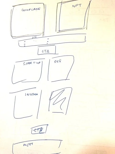
Before I create the Lo-fi, I always sketch a rough layout first to ideate some quick ideas on the possible layout options
Utilising grids to create pixel perfectly aligned designs, the initial stage in my design process is to create lo-fi prototype to initially create spaces and alignment where each section of text should be located. This provides an initial layout and framework to add the remaining text. In adhering to UI/UX principles:
Created an initial layout with even usage of negative space and spacing
Ensuring that alignment is correct
Working with the mobile version first to ensure responsive design
Spacing of each text section to make sure there isn’t too much text or it’s overwhelming

Defining style guide and brand guidelines
As the business already had a existing brand colours and text, it was important for me define those styles and colours to remain consistent with the branding of the business and create a cohesive design outcome.
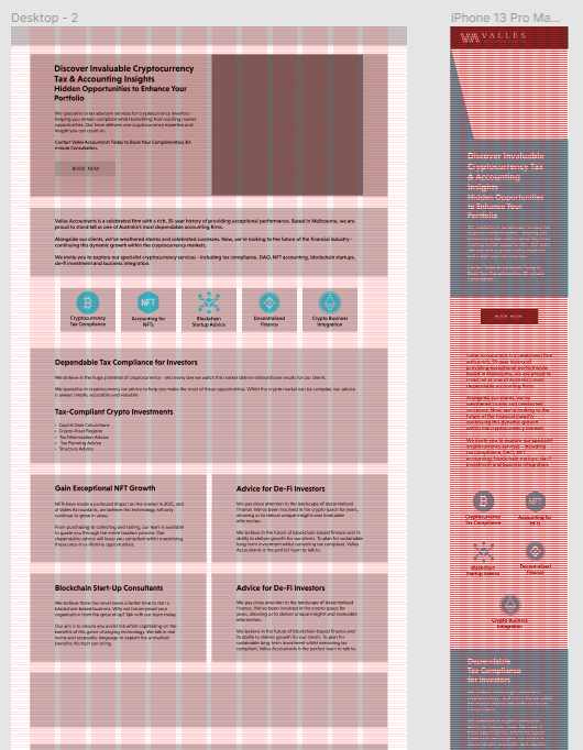
Mid-Fi Prototype - Adding text
Here, I began to add text, icons and colours to the lo-fi prototype.
Still using grids, I wanted to use grids to make sure all text were also perfectly aligned and spaced adequately to show grouping.
Did some colour blocking to create more separation between each section
Utilised logos to break up text
Learning:
I ran into the issue of having too much text for the original lo-fi design which lead me to change the original layout to be a lot longer (as you can see mobile is cut off). I found this to be a common problem and taught me to consider length of text before coming up with lo-fi design, or to do both at the same time especially for text heavy briefs.
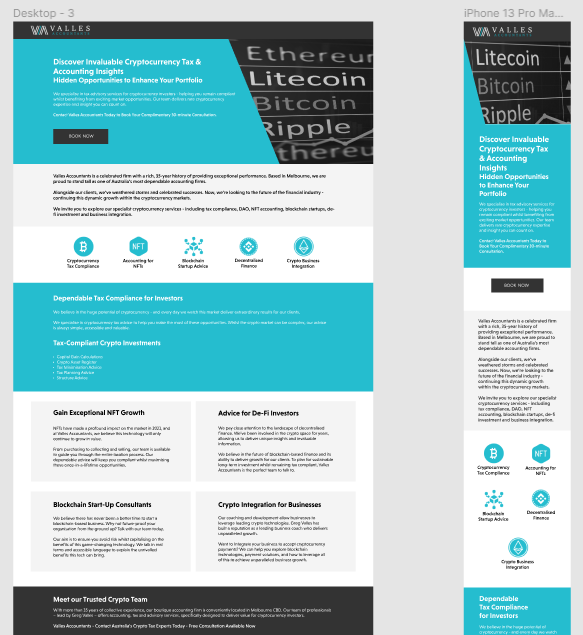
First Hi-Fi draft
First draft with text, colour and images
Feedback from users:
Too much text
Lacking design uniqueness compared to competitor sites
Not enough imagery to break up text
Needs reviews to generate trust
Too much info/chaotic
Too plain of design
Need images of people to create trust
Need contact us at the bottom


Different solutions/versions of 2nd Hi-Fi draft
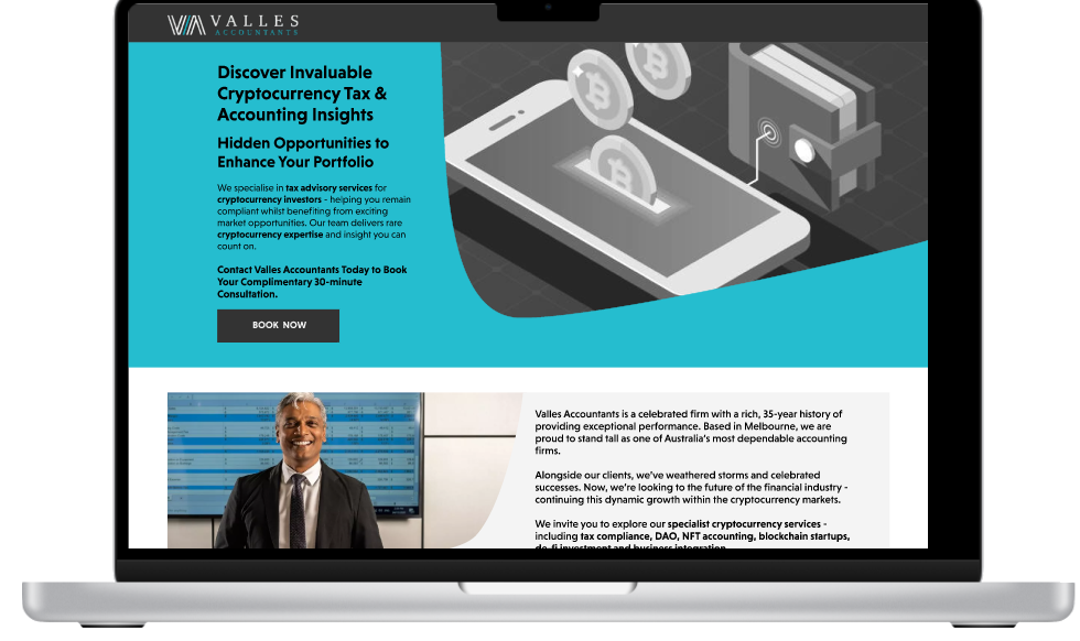
Final draft solution for design
Chosen because:
Best experience for mobile - the version with too many images made the scrolling too long
Changed font colour from white to black due to the contrast being too low and affecting visibly/accesibility
Added more colours to break up text
Added drop down boxes to reduce “text-heavy” nature of page


Click here to see full mobile experience

Current Prototype