Problem:
A new ePlanning portal was being launched to modernise the planning application process for users. Looking at the initial developer version of the platform from a design perspective:
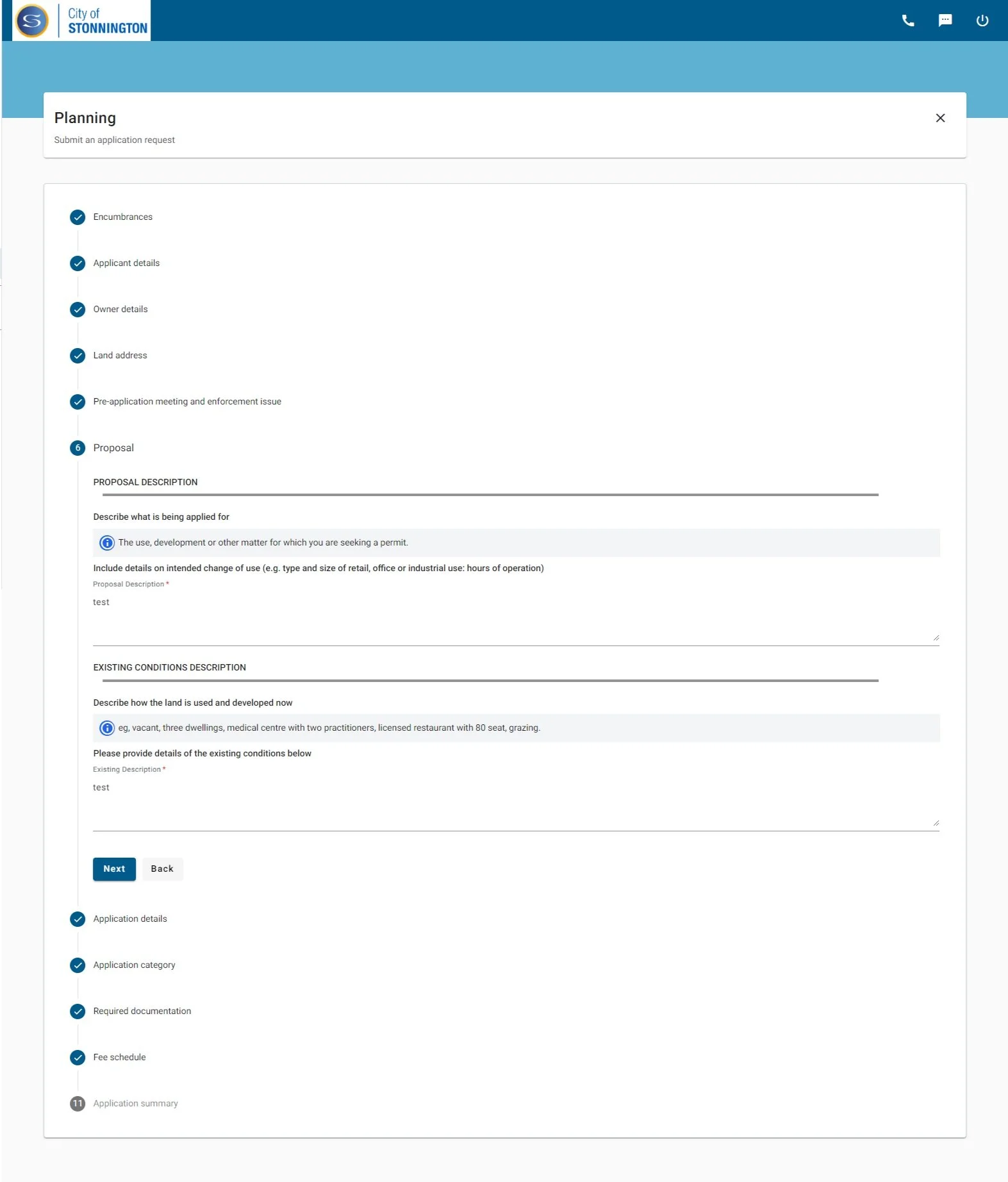
The visual hierachy was confusing due to the poor use of colours and font size
Language did not meet accessibility guidelines

UI adjustments:
The design improvements focused on improving navigation, readability, and overall design to create a user-friendly platform accessible to all members of the community. Prototyping through Figma, design improvements were created to visually show how the design could be imrpoved.


Usability testing was also performed with 14 testers of diverse backgrounds and age range. The testing aimed to:
Identify pain points and user errors
Provide data for design improvements
Remove barriers to application completion
Understand customer’s mindset
Through usability testing, it was found that:
Customers have a lot of uncertainty on whether they have completed the application correctly
The legal jargons used were often confusing and contributed to the uncertainty
Without clear buttons indicating where to submit an application or raise an objection, users found it challenging to navigate the process effectively.
It was therefore suggested, in addition to UI improvements, that:
Language are simplified for improve readability
More helper text is added to assist customers in understanding the correct way to fill out the form and where to navigate to
Section names should be updated for clarity, ensuring that each part of the application clearly outlines the necessary actions required.
Technical limitations and solutions
The product was extremely limited in what it can and can’t change. Working closely with the project manager who had frequent communication with the vendor, we aimed to understand technical limitations. Aiming to try to prioritise accessibility, we were able to:
Update the wording and texts to improve over all usability
Improved the ways headers and texts were put together to improve visual hierarchy and reduce confusion
Improved the use of colour of buttons and helper boxes to reduce confusion
Add helper text to help indicate how to submit an application
Impact
Enhanced accessibility features for diverse user needs
Improved readability through updating and simplifying copy and enhancing accessibility of the portal
Streamlined user interface for intuitive navigation
Increased effectiveness with responsive design through UI updates